Words: Jonathan Wells
It rolls off the tongue, doesn’t it? Rolls-Royce. Even the simple, syrupy syllables themselves sound luxurious; sumptuous. And there’s a reason for that. A mainstay of the annual Luxury Industry Brand Index — and currently the influential list’s highest-ranking automotive company — Rolls-Royce Motor Cars is synonymous with opulence, affluence and the smoothest rides in town.
But it hasn’t always been this way. Founded in Manchester almost 120 years ago, the brand started out in the crane business, before motoring its way into the luxury car sector. And, during the last century, there have been plenty of bumps in the road. In 1971, the company entered voluntary liquidation, and was bought by both Vickers and Volkswagen in the years that followed. But the brand has always prevailed. How? Primarily, because of that name. Rolls-Royce Motor Cars is a name that, to this day, inspires grandeur, elegance and admiration in anyone who hears it.
So imagine our surprise when, earlier this week, the heritage motor manufacturer announced a rebrand. “Rolls-Royce announces new brand identity,” read the email that sped into our inboxes, “to further modernise the marque”. Puzzled? We were. Why would a brand, so lauded for its historic deference, decide to change its entire identity — a decades-long legacy that so clearly draws in, reassures and delights its customers?
The answer? For that, we must turn to the company itself. We asked Melanie Asker, General Manager for Client & Brand at Rolls-Royce Motor Cars, to show the brand’s working when it came to the rebrand and discovered why this might be one of the boldest and riskiest – yet smartest – moves in the carmaker’s history.
“Rolls-Royce has a rich and varied brand heritage,” says Asker — putting it mildly. “And, as part of this process, it was important for us to acknowledge the history whilst taking the opportunity to modernise the visual language — ensuring the identity is reflective of the contemporary brand that Rolls-Royce is today.”
It sounds confusing, but it’s not. Asker’s simply saying that the main thrust of the project was to ‘look to the future while acknowledging the past’. In theory, easy enough — but that can a tricky line to walk. Push too far into the future and you’ll alienate the loyal customer base who pushed you up to the pinnacle of the luxury sector to begin with. Remain too entrenched in the past, and you’ll never attract a new generation of buyers.
“So we were compelled to develop our new visual identity,” explains Asker. “Based on both the increasingly diversified needs of our client base and the new flexibility for digital communications. For us, the change was about creating the new chapter of Rolls-Royce history.”
Again, easier said than done. For a brand that famously takes its time on important projects — the last big release, the Cullinan SUV, was confirmed to be in development by the brand five years ago but didn’t roll into the UK until November 2018 — how long would it take to rebrand the whole company?
“We evolved our strategic brand approach over a period of years,” reveals Asker, “but the visual identity element specifically has been worked on for the last 12 months, as a full-time endeavour.”
And no expense has been spared. Asker and her seniors called on the expertise of the world’s largest independent design consultancy, Pentagram, to help with the daunting task.
"It was important for us to acknowledge the history..."
“We undertook a detailed partner evaluation,” says Asker, “taking time to choose the right partner for this important step in the modernisation of the marque. We selected Pentagram based on their outstanding expertise and capability — and were drawn to their ‘non-automotive’ approach.”
A ‘non-automotive’ approach may sound like an odd way to go, but Asker assures us that it wasn’t a decision made lightly. Instead, one of the principal aims of the rebrand has been to steer Rolls-Royce’s reputation away from that of simply being a carmaker — and instead fuel its perception as a wider luxury brand. When we see Apple these days, we think less of the specific electronics and more of the broader ‘lifestyle’ the brand affords us. Cartier may be a jeweller, but the name tends to signify ideas of taste and wealth over individual rings and watches. Rolls-Royce hope to achieve a similar effect with this latest rebrand.
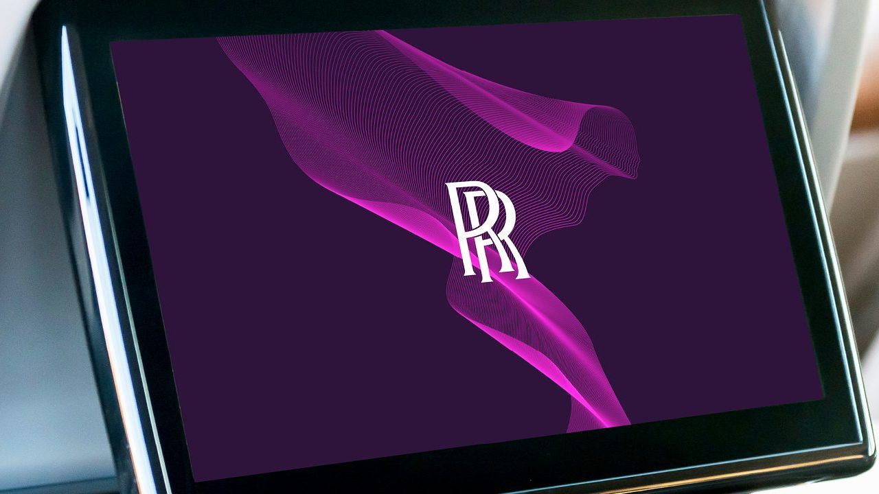
So how have they done it? First up came a new splash of colour. Like the many bespoke paints used in the brand’s Goodwood factory, the options were almost endless — and yet a deep, majestic purple piqued Pentagram’s interest. We can see why. Historically rare in nature and with roots in mythology and royalty, purple has always been an indicator of wealth and power — much like Rolls-Royce cars. And so it was out with the existing brown and slate palettes, and in with this expressive, luxurious new hue; aptly named ‘Purple Spirit’.
“Purple Spirit has a deep and powerful tone,” Sami Coultas, Bespoke Colour and Trim designer at Rolls-Royce, tells us. “It’s a colour of modernity that evokes connotations of the dark and majestic night. It’ll also be complemented by a foiled Rose Gold which will add elegance and grace to the marque’s printed materials.”
That typeface, too, is new. Pentagram uncovered typography in the Rolls-Royce archives from the 1930s, and used the art-deco style as the basis from which to create a new look. Furthering the desire to position Rolls-Royce as more than a carmaker, the words ‘Motor Cars’ have been reduced in size — and the ‘R’ character alone went through countless revisions in order to display the ‘stability and prominence’ the brand wanted to convey.
But perhaps the biggest change comes in the angelic, feminine form of the Spirit of Ecstasy. Rolls-Royce’s instantly recognisable bonnet ornament has graced the marque’s cars since 1911 — when she was drawn and sculpted by British artist Charles Sykes. To pay homage to Sykes’ creation, but also modernise the icon and pave the way for it to become the brand’s new lead logo, illustrator Chris Mitchell was drafted in to develop a ‘distilled form’ of the statuette. But why the simplification?
“To read clearly in today’s virtual world,” explains Melanie Asker, “and offer flexibility in its digital execution. The original illustration of the Spirit of Ecstasy was too detailed and needed distilling to have the desired presence online. Close attention was paid to her proportions to ensure she carries the strength and power of her original form. In addition, her direction has changed from left to right, boldly facing the future, reflective of the marque itself.”
Prominence in the digital world appears to be the driving force behind the rebrand of Rolls-Royce. The company’s digital presence has indeed increased significantly in recent years — though perhaps more slowly than its competitors — and this has led them to examine how the company communicates with clients around the world. Not only that, but it has also forced the brand to adapt its existing century-old iconography for new digital platforms and mediums.
“It was essential,” says Asker, “for the identity to appeal to our new demographic of clients and all that they represent — both digitally and physically. And success for us is garnered in feedback from clients and enthusiasts around the world, when they comment that our new visual identity feels more ‘Rolls-Royce’ than ever before.”
The initial reaction, indeed, seems to be positive — with only a handful of commentators voicing their concern over the use of purple, or the stripping back of the Spirit of Ecstasy. But wasn’t that always going to be a problem? After all, nearly every Rolls-Royce car is bespoke — tailored to the the lifestyle requirements and personal tastes of each customer — so there could never be a rebranding that pleased everyone.
And yet, we think the rebranding feels suitably luxurious — staying true to the melt-in-your-mouth Rolls-Royce name. As Asker says, the commission, design, curation and assembly of the company’s motors “transcends the automotive sphere”. And, from the rich, royal purple to the slick, modern take on Spirit of Ecstasy, the rebrand does reflect this — and sleekly shows Rolls-Royce’s ascension from car manufacturer to true luxury brand.
Want more British carmaking news? Here’s everything we know about the Ineos Grenadier…
Become a Gentleman’s Journal member. Find out more here.
Become a Gentleman’s Journal Member?
Like the Gentleman’s Journal? Why not join the Clubhouse, a special kind of private club where members receive offers and experiences from hand-picked, premium brands. You will also receive invites to exclusive events, the quarterly print magazine delivered directly to your door and your own membership card.