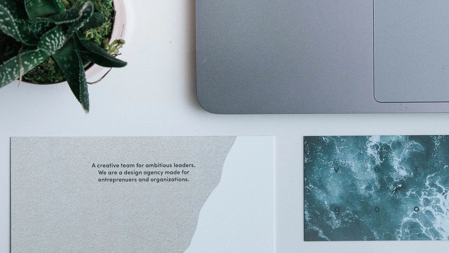

How to design the perfect business card
Old-fashioned? Perhaps, but there’s no greater networking tool out there…
Words: Zoe Dickens
If you’re under the age of 30, chances are you’ve never had a business card. Who needs a bit of paper with their name and number on when you can send a WhatsApp or drop someone a DM at any time?
True, there are more modern ways of connecting but to disregard the humble business card is a big mistake. It’s the greatest offline networking tool available to the modern business leader and, if you get yours right, can make both a brilliant first impression and lasting impact on potential clients. And, since you’re not going to be doling out that famous handshake you worked so hard on any time soon, it’ll pay to have something else up your (metaphorical and literal) sleeve. Here’s how to design the perfect business card.
Consider your industry
When you begin designing your business card the first thing you need to think about is who you’re going to be giving it to – and what impression you want to make. This will largely be defined by your industry. If you’re in a corporate industry, such as financial services, chances are your networking is limited to those in similar businesses or potential clients also working for large corporate firms. In this case, steer clear of gimmicks or over-the-top design embellishments – your business card should perform the functional job of providing your details in a professional manner.

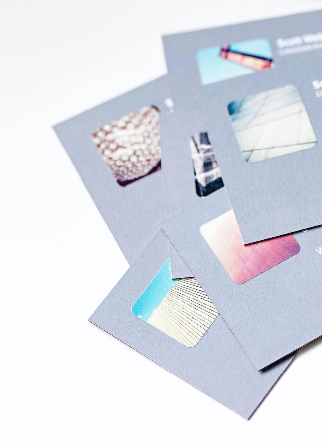
However, if you’re a small business owner working in a more creative industry – say a personal trainer or freelance graphic designer – you can afford to have more fun with your business card. This is especially true if your clients tend to be the general public, in which case your business card can also act as a form of advertising. A quick Google search will provide plenty of inspiration – how about a roll-up business card for a yoga instructor or a fashion brand who’s business cards also double up as clothing tags? The world is your oyster.
Keep it simple
No matter which format you decide to go for, when it comes to actually laying out and designing your business card, any good graphic designer will tell you that simplicity is key. Opt for a nice, clear, classic font and display your company logo on one side and your name, job title and essential contact information on the other. Do not be tempted into ‘jazzy’ (read: hard to decipher) typefaces or unnecessary illustrations and imagery – it will only make your business card look overcrowded and reflect poorly on your sense of taste.
Stick to your company branding
Yes, your business card functions as a way of providing potential customers with your specific details – but it’s also a calling card for your company at large and as such should be consistent with your business’ wider branding. Yes, that brightly coloured, metallic finish business card may look eye-catching but, if the rest of your branding is minimalist and monochrome, it will look out of place, confusing and unprofessional. Similarly make sure everyone in your organisation has business cards with the same design and layout. You want to present a uniform front so even the CEO shouldn’t get special treatment here.
Invest in quality card
Every budding business owner wants to project an image of themselves as being a leader, in charge and – most importantly – the perfect partner for potential clients. A flimsy piece of cheap card does not say ‘profits guaranteed’ so don’t let your paper stock become an afterthought. Most good printers will happily send you samples of their card; we’d recommend a thick, matte finish of no less than 300gsm in weight.
That said, this is another area where it’s also advisable to rein in your more creative tendencies. While you can get business cards made in practically any material, this can do more harm than good. Expensive metal cards can come off as flashy and unnecessary while those that double as USB sticks – while a good idea in certain situations – can seem a bit forward (and you’ll want to be very careful about what information you’re allowing out into the world). As a side note, be sure to stick to standard sizing. There’s nothing more irritating than a business card that doesn’t fit in your wallet.
Triple check your information
At their most basic, a business card does one job: provide your contact information to people who need it. If you’re handing out cards with a spelling mistake in your job title or an incorrect phone number, not only does it undermine the card’s one and only true function, it also makes you look more than a little incompetent. Check and check again gents.
Looking for more business advice? Here’s how to write the perfect business email…
Become a Gentleman’s Journal member. Find out more here.


