What your business card says about you
From stock to font to design, the options are endless. But what does your calling card say about you?
- Words: Gentleman's Journal
We all have them, small rectangles upon which our entire professional life is presented. And, from stock to font to colour to size, every little thing about these calling cards says something different about you. So, in an increasingly digital world, when such tactile touches are appreciated above almost every other business tradition, how can you ensure that your business card is sending the right message. In short: what does your business card say about you?
Gentleman’s Journal asked graphic designer and specialist in logo design Stephen Hoper why business cards are so key. “They’re very important,” says Hoper. “You can tell a lot about someone from their card, so developing a business card is a task which will affect the first impression on your current and potential clients.”
With this in mind, read on for the top tips to follow if you’re considering a redesign.
Begin by establishing - and sticking to - a brand identity...
We heartily recommend working with a designer to create a visual identity — however simple — that can be used in a consistent way as the foundation of all future promotional designs, helping to create a distinctive and successful brand.
Once a visual identity has been designed, it’s a relatively simple task to design consistently-branded promotional items such a business card, stationery, website or brochure.
Consider fonts and colours...

The choices of font, stock and colour scheme have a huge influence on the resulting card design. There are no choices that are unsuitable for every business/individual – even (dare we say it) Comic Sans might be the most suitable font for certain projects – but there will be choices that are more suitable for any particular business/individual.
The fonts and colours should be defined by the brand identity, so that the person’s business card has the same branded style as their other promotional items.
Consider what you're printing on...
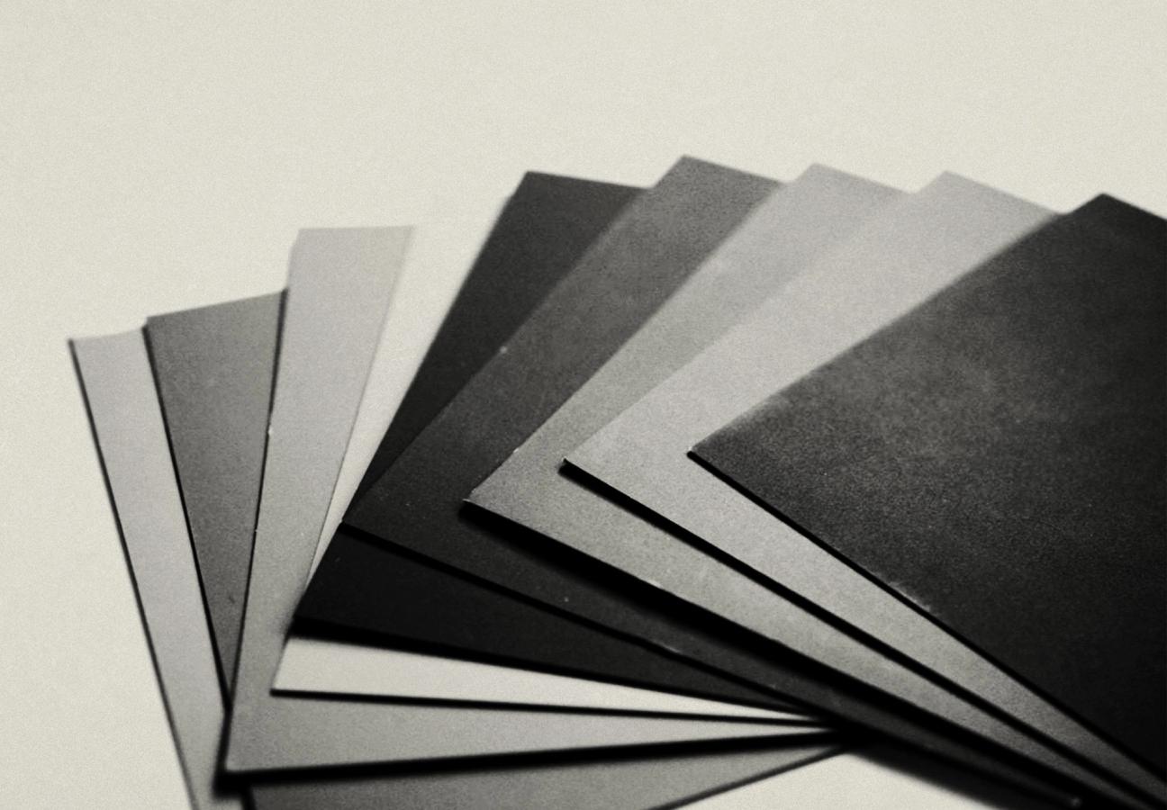
Unusual materials/finishes/shapes and layouts can be very attention-grabbing, and are suitable for certain businesses or individuals who want to stand out from the crowd and emphasise the difference between them and their competitors, but they’re not suitable for all projects. The best approach is to discuss the available options with your designer and then make some choices which are likely to appeal to your current and potential clients.
For example, a business with a strong eco-friendly message might want to use card stock that is obviously recycled, whereas someone working in a traditional field such as law might prefer to play it safe and follow their industry’s design conventions.
Size matters...
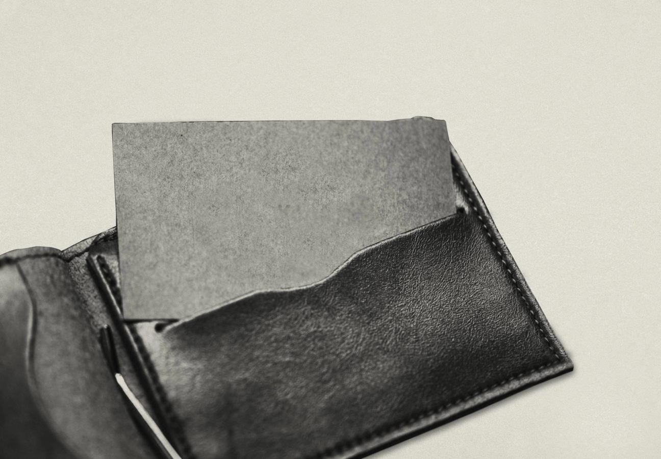
It’s usually a wise idea to create a rectangular card at a standard UK size of 85x55mm – a smaller size could work well, but I wouldn’t recommend using a larger size as it might not fit into the receiver’s wallet. When laying out the design it’s a good idea to include plenty of blank space rather than overcrowding the layout – ‘less is more’ is always a good rule of thumb.
It can be useful to test-print a single copy of a card design yourself, at actual size, to confirm that the design works well in context before committing to ordering hundreds of professionally-printed cards.
Looking for more shortcuts to success? Here are 9 ways to win a business deal…


